
Prelude Chamber Music:
Brand Identity & Case Study
-
Task
Create an updated branding system for a non-profit organization located in Jacksonville. The branding system must be modern, classic, and sophisticated to appeal to Prelude Chamber Music’s very different audiences; student musicians and donors.
-
Solution
Creating a modern logo that maintains Prelude Chamber Music’s association with the violin and focusing on serif typefaces to create a design that appeals to all generations.
-
Applications
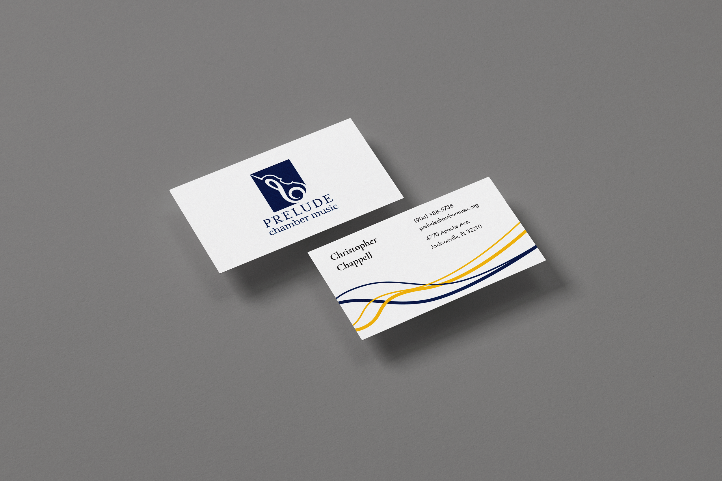
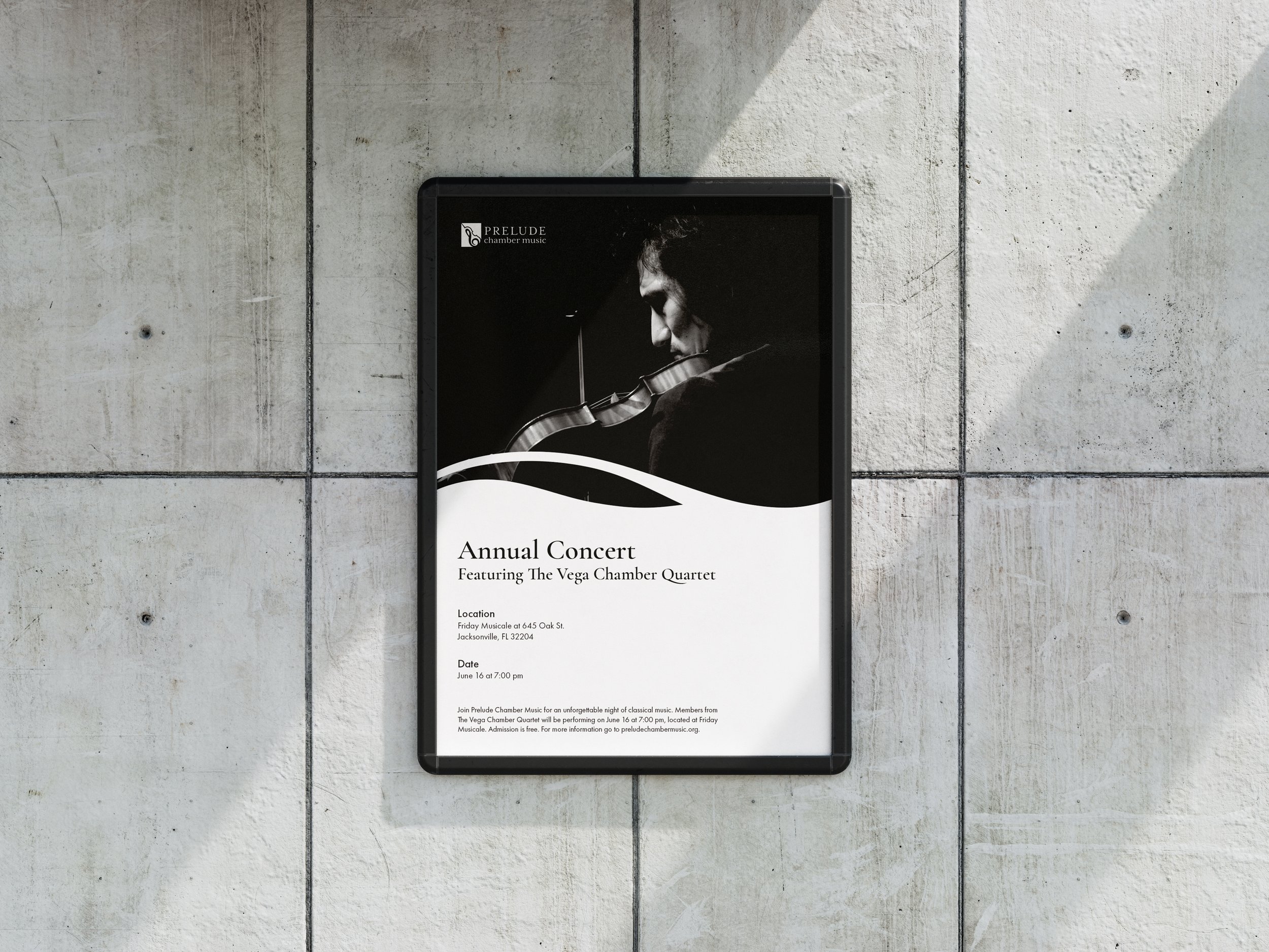
Updated branding identity including logo design, stationery set, and posters advertising Prelude Chamber Music’s summer camp and annual concert.
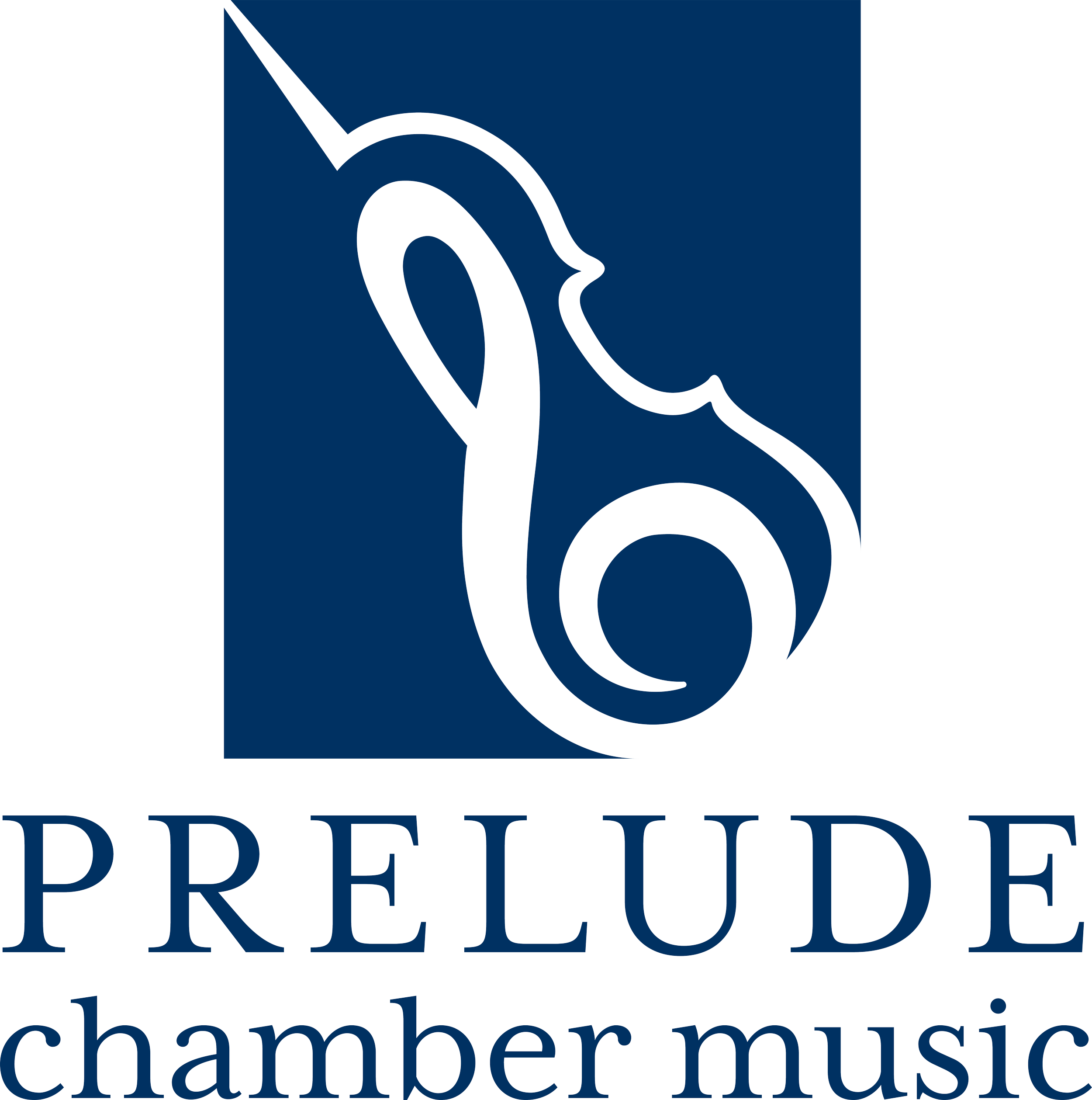
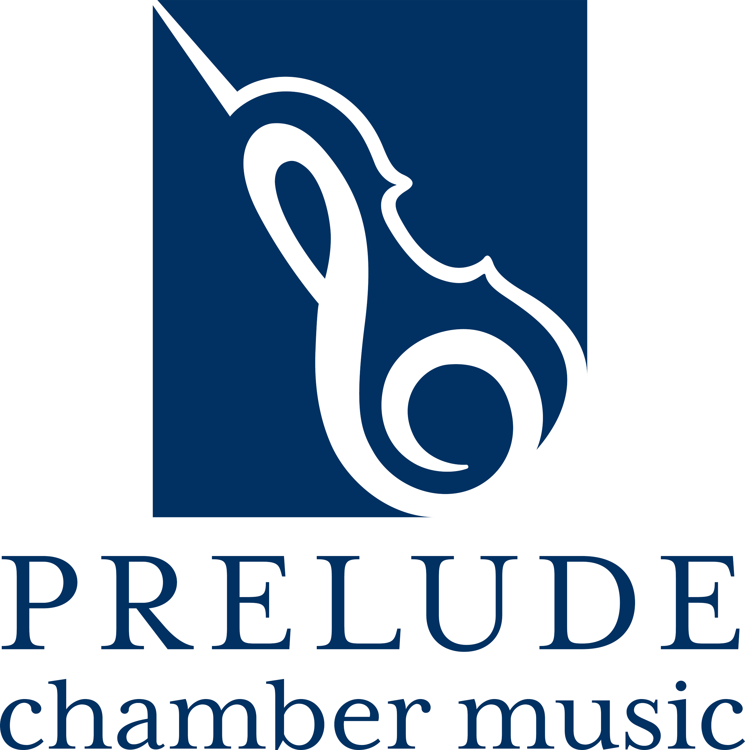
The logo is a combination of a violin and a treble clef. The logo has a classic look due to the negative space and serif typeface. The violin was chosen because it maintains Prelude Chamber Music’s sophisticated identity and shows how the organization focuses on teaching chamber music, mainly string instruments, to children of all ages and all skill levels. The treble clef can usually be seen on a sheet of music and indicates where the musician begins, much like how “prelude” means introduction.


Case Study
-
I worked with a local Jacksonville NGO, Prelude Chamber Music. The goal was to create a better way to reach out to creative and talented youth. Prelude Chamber Music wanted to appeal to middle school and high school kids while still maintaining a classic approach. They wanted a modern and traditional brand identity so Prelude Chamber Music could appeal to student musicians and donors respectively. The main challenge was appealing to these two very different generations. I overcame this challenge by combining a modern logo with a serif typeface, Mrs. Eaves, and including a sophisticated navy blue that pairs well with the secondary color, gold.
Before
After
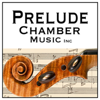
-
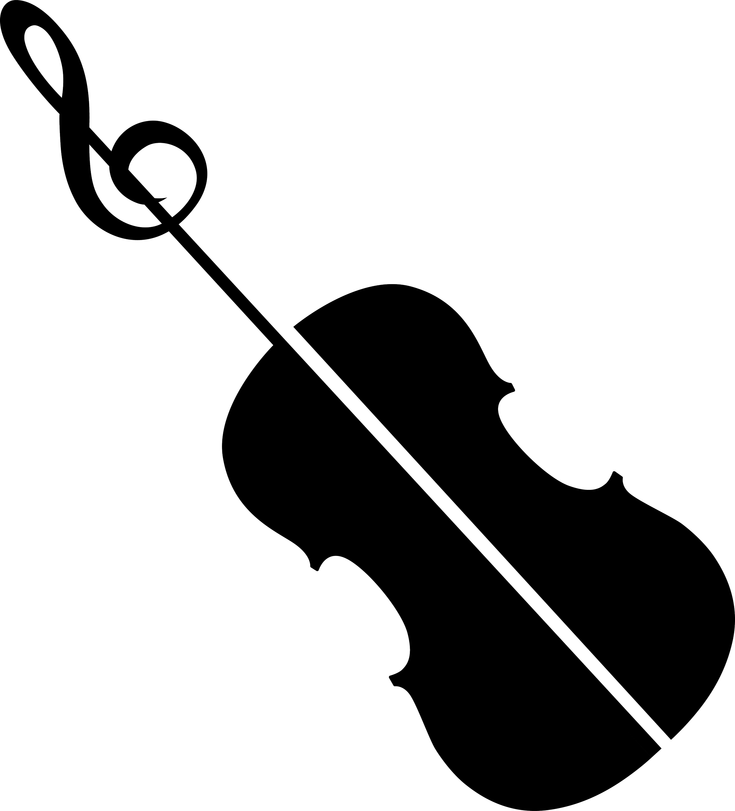
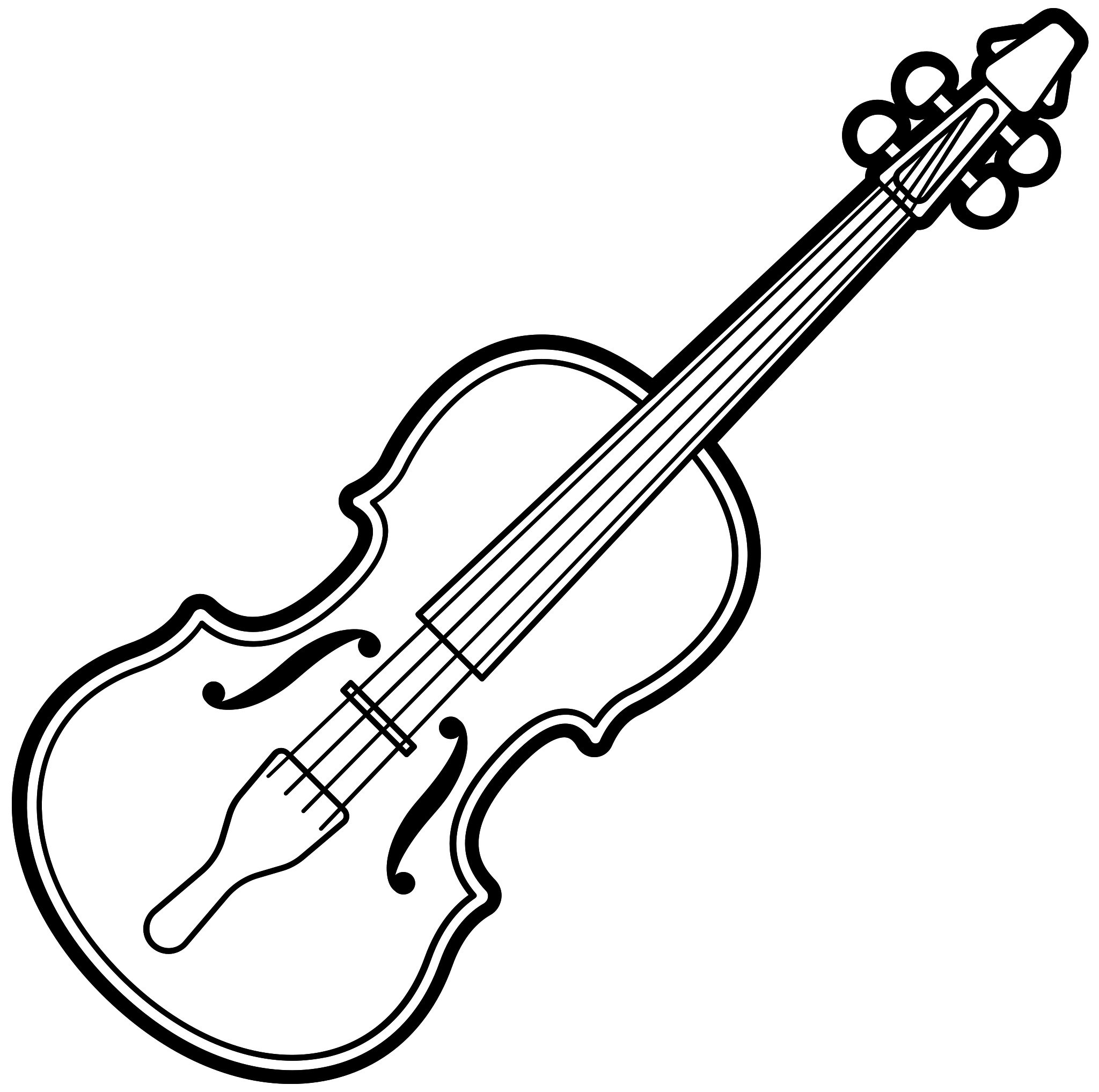
The original idea was to combine a violin and a treble clef to create a unique mark. Prelude Chamber Music wanted to keep their previous association with violins evident in the logo because the violin is their main focus and it’s how their audience identifies the brand. I included a treble clef because the name Prelude means the beginning or introduction; much like how the treble clef can be used to indicate when to start using a certain pitch. The most well received thumbnails were the combination of the violin and treble clef, the nightingale, and the abstract mark. The nightingale was a more symbolic option for Prelude Chamber Music; it represented the brand’s passion for music because nightingales are the songbirds of the animal kingdom and are known to harmonize with one another. The abstract mark was representative of a swan to show Prelude Chamber Music’s elegance and sophistication, and a tulip growing to indicate how they educate and inspire students.
Thumbnails

Violin and treble clef
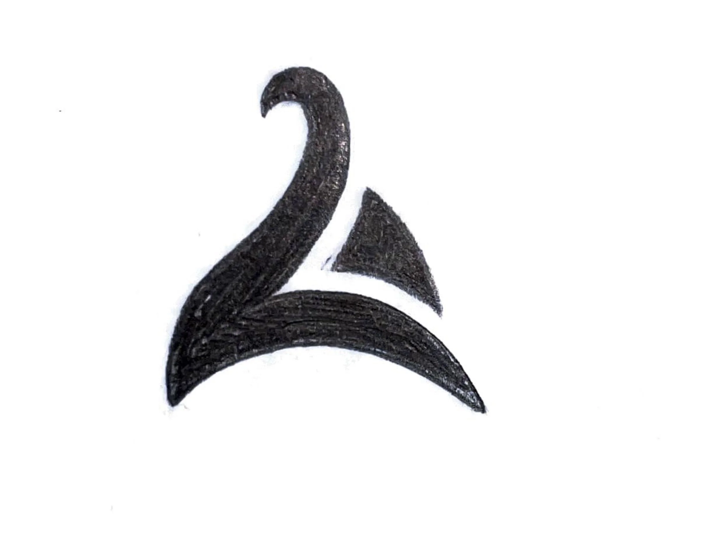
Abstract swan and tulip

Nightingale
Roughs







Comps




-
The approach to the violin and treble clef design is successful and carries enough visual weight against the logotype. This version is more dynamic and features more space between the violin and the music note. The curves of the violin are easily recognizable and blend into the curves of the treble clef. The unique mark is created using negative space. The navy blue box in the background adds closure and resembles Prelude Chamber Music’s frame around their previous logo. The violin and treble clef are placed at an angle to create movement and the eye is drawn to the bottom right corner where the base of the violin and music note greet the outside of the box. The modern and curvilinear logo appeals to the students while the serif logotype and the sophisticated navy blue color appeal to the founders and donors.

+
=

-
I learned how to keep the brand’s previous identity intact. Prelude Chamber Music’s previous logo was a violin handle, to maintain the brand’s association with the violin I created an outline of one combined with a treble clef. The brand had stacked logotype so this approach was continued in the new logo. I also learned how to create a logo that had two opposing tones, modern and traditional, and two opposing target audiences, students and donors.